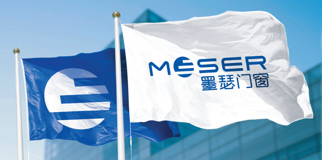
On April 13, 2021, mo se doors and windows launch a new brand LOGO and related visual communication system. It aims to better interpret the brand's concept of energy conservation and environmental protection and create a more high-end and comfortable window life for a new generation of consumers. This update symbolizes the beginning of a comprehensive upgrade of the Mo se brand.
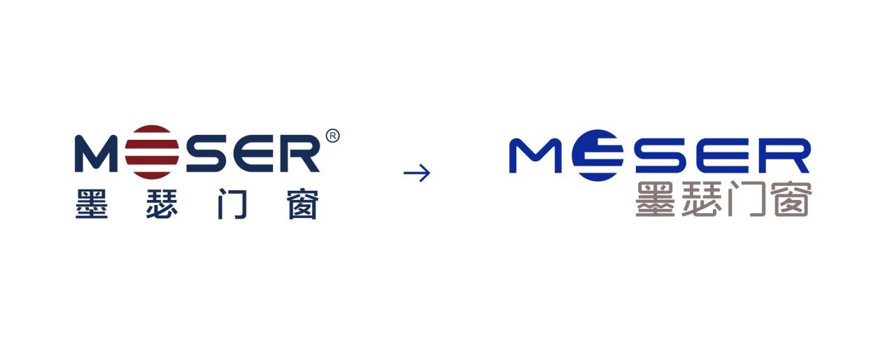
Mo se the new image was built by Mr. Cedric Mo SE, the brand creative director of Allemann, who led the design team. Cedric believes: "doors and windows are a bridge between reality and future life, the brand-new vision also reflects Mo se persistent pursuit and exploration of quality life." As for the new logo changes, Mo se brands interpret it in this way: "The new vision consists of two new popular colors," close to pure blue "and" European brickearth tone ", which are the latest standard colors, it fully demonstrates the accumulation of the brand from Europe in 1955, the pure ingenuity of doors and windows, and the" blue sky doctrine "advocating environmental protection '."
The design of the new VI reconstructs standard colors and standard fonts at pixel level, which explains the spirit of advocating environmental protection and continuing to move forward in Mo se. From product packaging, store design to extended items, the brand visual identification system will be fully upgraded, and the design will be more in line with the simple and fashionable modernism trend.
The new version of LOGO English has been upgraded and improved in the original English visual presentation. The change and inheritance of the English part "O" is the biggest change in Mo se. Fine-tuning based on the original LOGO is the finishing touch of the entire LOGO, like the projection of the sun shining into the window, and also like the wooden beam pointing in the product. This design is in line with the sustainable development vision of the industry. The length of bar elements in the "O" logo is not progressive one by one. Mo se doors and windows refined production and manufacturing techniques are interpreted vividly, showing extremely complex and orderly techniques and ingenuity behind a window, reflecting the spirit of continuous progress and continuous innovation of Mo se. In addition, O shaped like the number 0 also carries the Environmental Protection ideal of Mo se '0 carbon emission."
Excellent doors and windows do not stop at creating beauty for users' daily life, but the construction of this environment is also reflected in mo se doors and windows in the application of museums, super landmarks, apartment buildings and other places. The brand-new logo is not limited to the static logo itself seen visually. It has avant-garde color and flat design, presents a continuous dynamic attribute, and is a symbol of Mo se moving from an "industrial entity" to the next era.
The Chinese design of LOGO also contains the deep thinking of Mo se brands. Taking the word "ink" as an example, it combines the eaves shape elements in the building, implying that doors and windows are inseparable from home. In addition, Mo se also optimized and simplified each joint of Chinese characters, combined with the round lines of Latin characters, to unify the glyphs in Chinese characters with "MOSER" English characters, it combines modern hard technology with Chinese elements that are quite fluid, and gives LOGO a more modern, balanced and comfortable visual experience. This elaborate design conveys a life concept that combines technological intelligence with comfortable life. While highlighting the inheritance and continuation of Mo se brands, convey its firm belief in meeting future challenges.

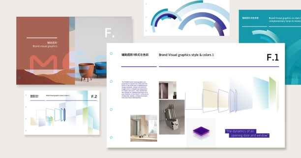
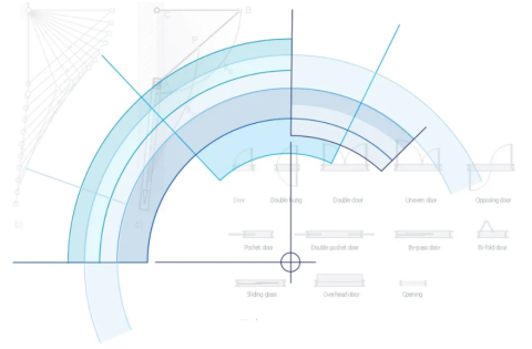
This time, Mo se also carried out a new extension design for auxiliary elements. Its core elements are inspired by the dynamic presentation of Mo se multi-layer glass and the rounded radian of windows. Through the free opening of windows, define Mo se new roles that are more open, innovative and inclusive. Mo se this new VI upgrade precisely analyzed and recombined the existing design elements to meet the needs of the new era visually, it also reflects the transformation of Mo se from focusing on traditional industrial manufacturing to creating intelligent life products.
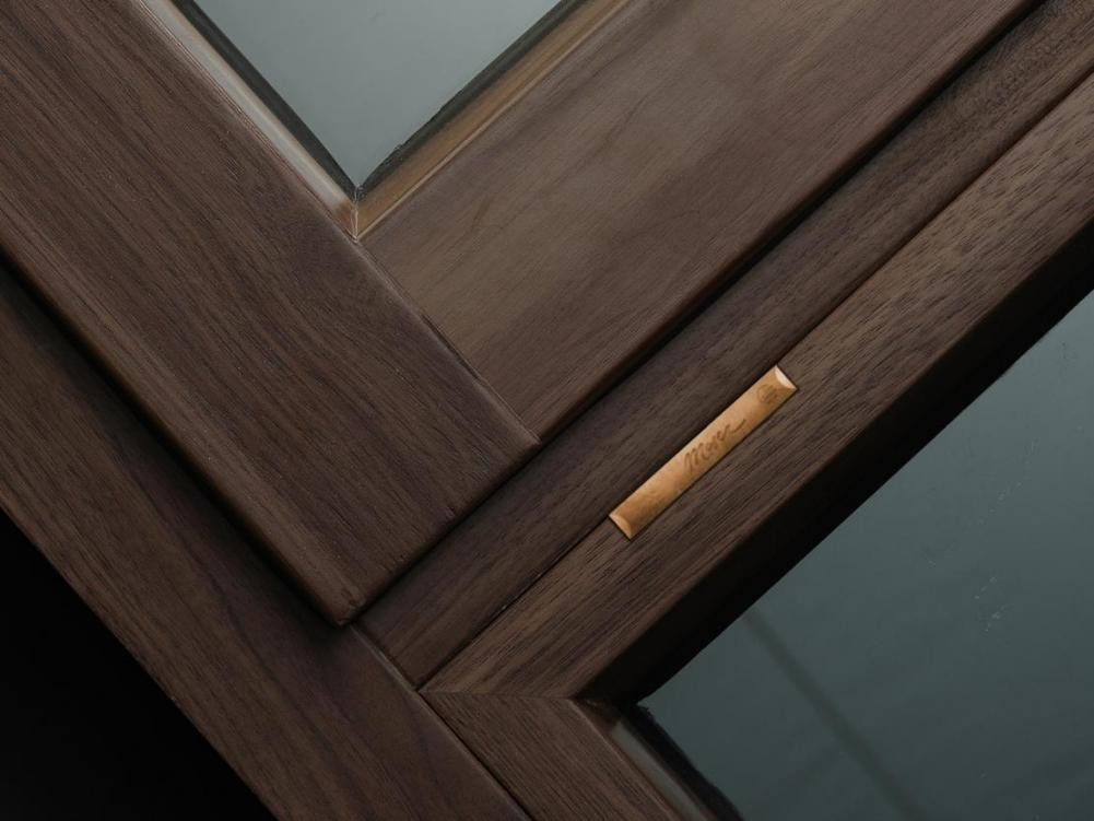
Over the years, Mo SE has been famous for energy-saving doors and windows, and is famous for the global and Chinese markets with the powerful energy-saving technology of aluminum clad wood and passive windows.
Its parent group, Orun Shunda, continues to work in the field of passive doors and windows and ultra-low energy consumption buildings. Mo se doors and windows at the same time of forming a joint force of high-quality technology, it will respond more positively to the Chinese government's goals of "carbon peak" and "carbon neutral.
The visual image of Mo se New Brand breaks through the original industrial hard and cold texture of the brand with humanized visual design, bringing more beautiful feelings in use to users and transforming towards more fashionable design. It can be inferred from the release of the new LOGO, mo se doors and windows the next brand strategy transformation will focus on the high-end user market, and its strong technical advantages and international cooperation advantages will become a strong backing to support its healthy development.